I made this commitment to write daily about something for which I’m grateful because I felt A NEED FOR OPTIMISM. Realizing that I have more than four things things to write about is … gratifying. After searching the term “need for optimism” the results are intriguing. Many good articles to read.
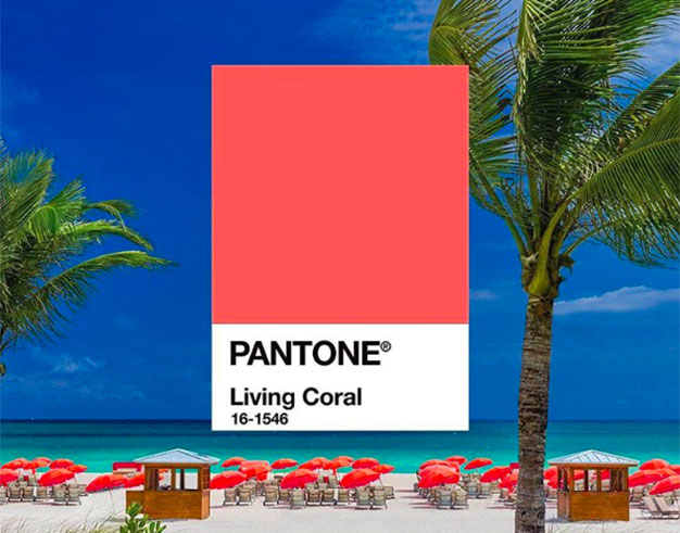
One of the most surprising was an announcement of the Pantone Color of the Year, something I follow as a graphic designer. This year it’s “Living Coral.”Pantone reports that the color was chosen because of our “innate need for optimism and joyful pursuits.” Laurie Pressman of the Pantone Color Institute explained, “We see the environment taking on an even greater role in the world we live in today for two primary reasons, one being how connected we are to technology. Because we are so connected to something that’s not real, we really need to find that balance closely and intimately with something that is real and you don’t get more real than nature.” For me, this is a three-fer: optimism, color, and honoring our environment.